2022
Art Direction
Graphic Design
Design
Graphic Design
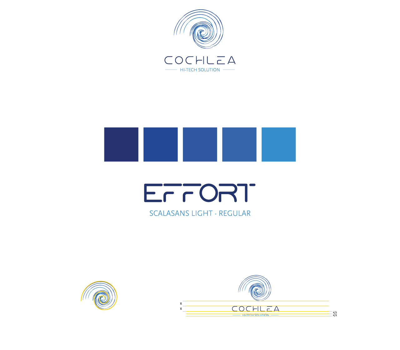
For the Hi-Tech company Cochlea we developed a logo design, with related corporate image and corporate website with Wordpress technology.
A project with a special graphic design study, which also involved the work of an illustrator.

The development of the logo had to encapsulate elements that combined the naming of the company and the medical and Hi-Tech fields that the products are a part of.
With this logo, we abstracted the concept of Cochlea, starting with the golden section and eliminating everything superfluous. The result is a stylized representation of Cochlea, consisting of 4 equal but shifted lines of different colors.

To match the pictographic part we incorporated a modern and technological font, contrasting with the style of the artwork above.
For the colors, we chose a palette of blue, which is often used in the medical and technological fields, and has always represented tranquility, a sense of security and trust.
Neatness, simplicity and sharpness are the three foundations of this logo.